When I was young John Romita Jr. (or JRJr) was one of my favorite artists. Sure I loved Carl Barks, Sergio Aragones, and John Byrne, but JRJr was different. He had a style that had a lot of lines in it, there was a lot of detail to his work. For me it was new, fresh and different enough from his contemporaries that his work always stood out in my eyes. I first remember him from when he was working on Daredevil. He helped create Bullet, Typhoid Mary and Blackheart. His work can be decisive, I think he is the kind of artist that you either love or hate.
His style wasn’t always like it is now, or even when he was working on Daredevil. His earlier work was more reminiscent of his father’s work. Take a look at the page below from Dazzler #1. It is much more traditional. Even his work on the X-men was not quite in the style that would become his signature look. As much as I love his early work now, it is his line filled style that is familiar to most readers that I really love. He may have lost a bit to his touch over the years but I still like picking up a comic, like this Suicide Squad issue, and finding his name in the credits.

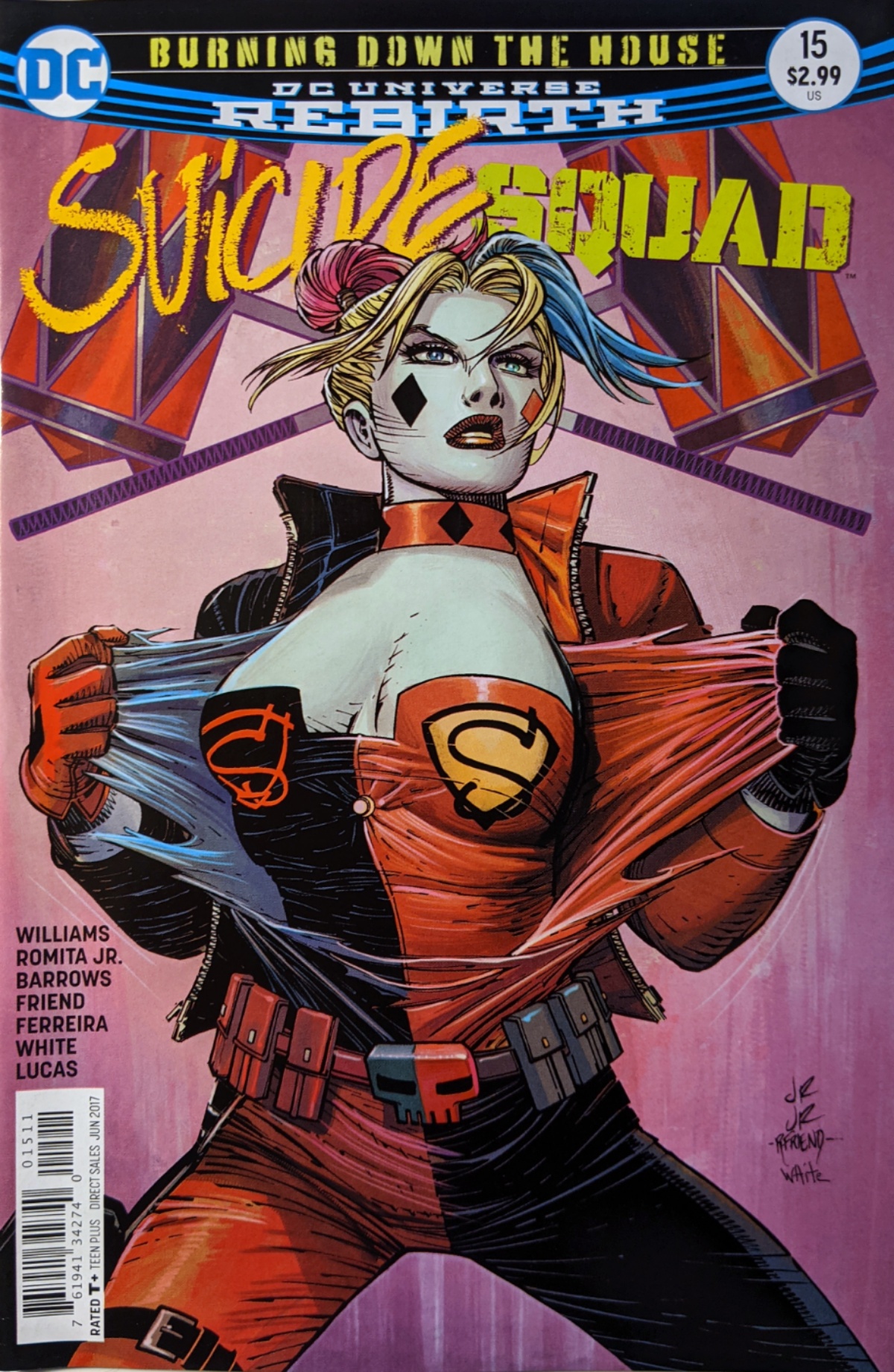
As an added bonus the scene on this cover actually happens in the comic. It is probably the best scene in the issue and actually makes the overly sexualized Harley Quinn funny for a brief moment. For all those reasons I think that this cover by John Romita Jr. is an awesome cover!

JR,Jr. did solid work on “Daredevil”, and was aided tremendously by one of the all-time greats, Al Williamson, inking JR, Jr’s drawings. Before that, he did some powerful, emotional stuff on “Uncanny X-Men”, inked by the thick, kinetic line work of underrated Dan Green. The newsprint pages then just soaked in that artwork. It didn’t seem to pop out on top, like on today’s glossy paper. Another good inker for Romita, Jr was Bob Wiacek, on “Iron Man”. JR, Jr’s Tony Stark looked ridiculous with his dated perm/”jerricurl” hairdo. But his Iron Man looked capable of everything seen in the MCU movies. It’s my second favorite Version of the character, after Adi Granov’s radically modern redesign.
Even Romita, Jr’s later Marvel work on “Avengers” with Klaus Janson inking him (were also together on the 90’s “Punisher” books, then on “Thor”) retained most the power and energy of his earlier work. One sequence in particular, where Spidey has to descend through the air to catch an unarmored Stark actually looks like the characters are moving on the static page,as you’re reading it The “magic” of the art form.
BUT, I have been underwhelmed and woefully disappointed, off put, by his DC output. He’s always said he has a “deadline style”. Whatever comes out on time is what we get. Which sux, when he’s capable of doing better. I’d be fine waiting 2 more weeks if it meant basic anatomy, consistency, and proportion would stay in tact. But they don’t. He doesn’t seem to care. He gives Batman stick legs. His faces are wonky. His Superman looks like his limbs were just stuck into his torso, and strips the character of his imposing presence. His Gorilla Grodd looked like a cross between a dog and a bear.
I actually avoid anything he draws, now. It didn’t help that Bendis dismantled one of the great backstories in comics, by changing the cause of Krypton’s destruction. Instead of a cautionary parable of environmental abuse on a planetary scale, we get a lone super villain. And the greatest secret identity maybe ever, thrown away. It’ll never work. You can’t have Superman that accessible, or his supporting cast that vulnerable. Short sighted, unimaginative. Just because it’s different doesn’t mean it’s best for the character, or the readers. Dumb. For a temporary sales blip.
LikeLiked by 1 person
His work on X-Men was indeed really special. I’m sure I’ve read some of that Iron Man but I don’t recall it now. I agree about his output at DC, it certainly is not his best work. That was part of the reason I noted this cover, I think it is quite good. It did cross my mind though that maybe his DC work is where it is at is because there is so much of it, maybe he is a little over extended. There are not many artists from his generation that still do interiors and he does turn out pages. I’m not saying it is right, or wrong, and not trying to say doing poor work is a good excuse to do more work, it’s just a though that came to me.
LikeLiked by 1 person